At the crossroads of cultures
ONG SHUNMUGAM
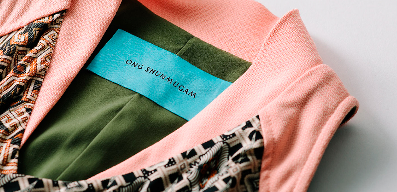
Singaporean fashion label Ong Shunmugam had grown from a fledgling name to one that was ready to take on the world. The atelier’s mission explores the crossroads between old and new, origin and identity. The results are a reimagining of not only traditional techniques and silhouettes, but also Asian symbolism and lore, for the modern world. Tasked to create a new identity for the brand, we introduced a revitalised brand world and fashioned new brand codes that would do justice to Ong Shunmugam’s deep Asian roots and global ambitions.
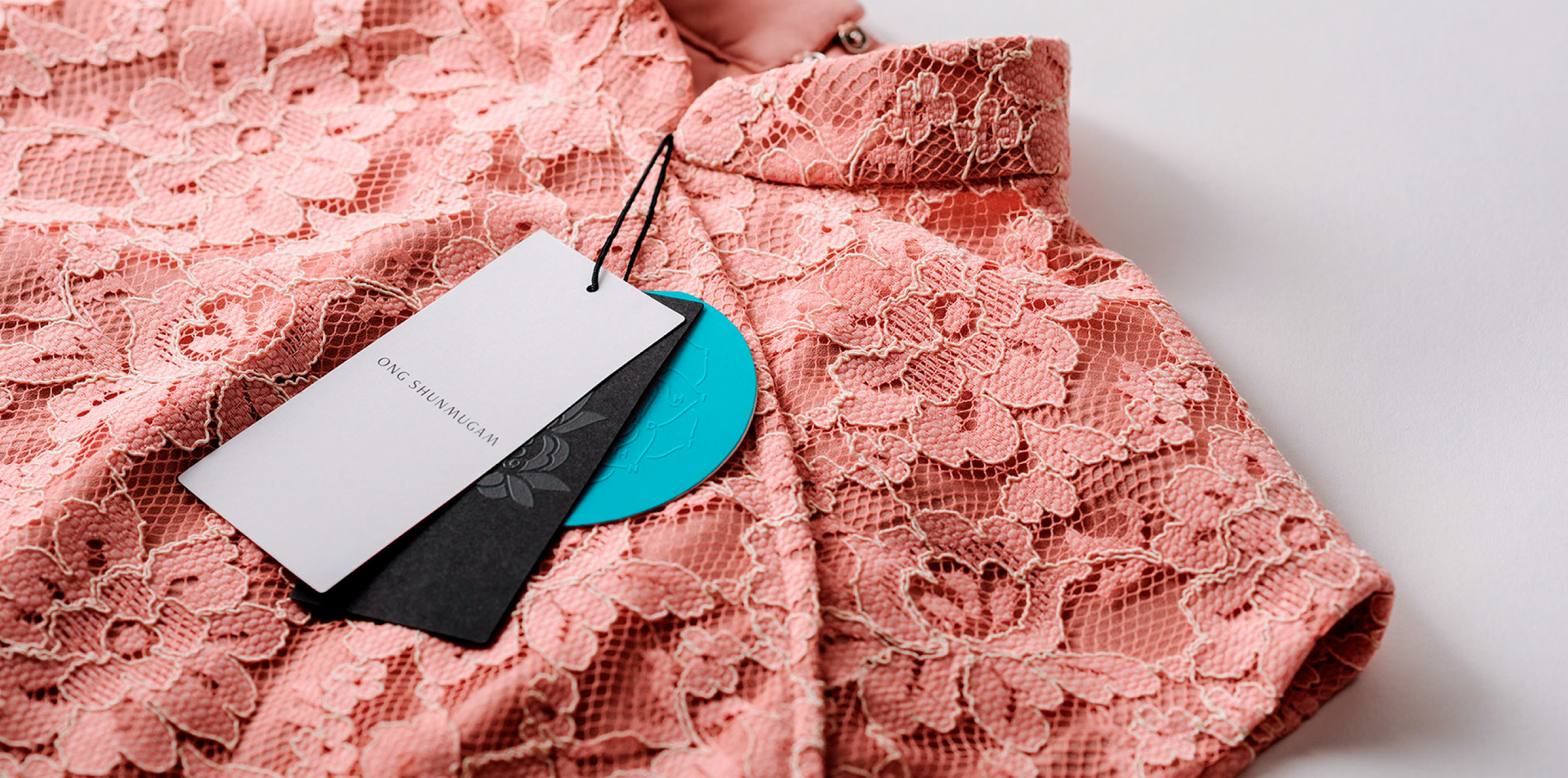
An Intersection of Cultures
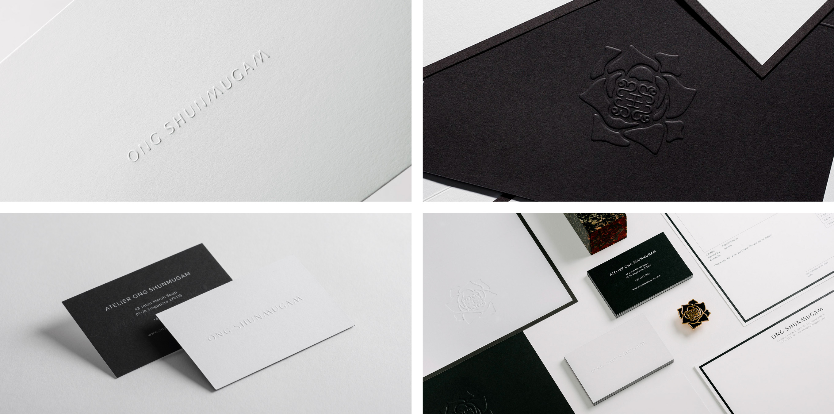
The refashioned Ong Shunmugam identity was built to reflect designer Priscilla Shunmugam’s own mixed Chinese and Indian heritage. The custom logotype is inspired by a blend of traditional Chinese and Indian calligraphy, while the monogram references the designer’s family names in both Chinese and Indian script. The Rangoli, a traditional Indian mark of harvest, became a signifier of a new collection for each season.
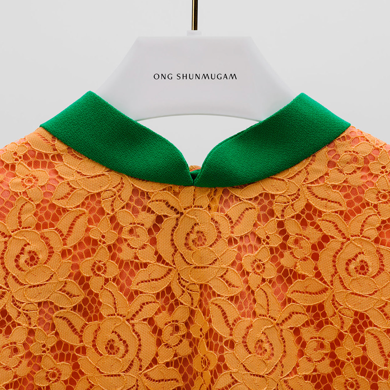
A Retail Ritual
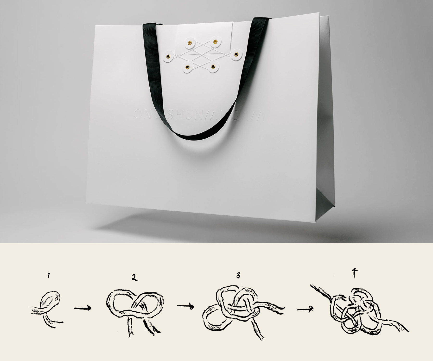
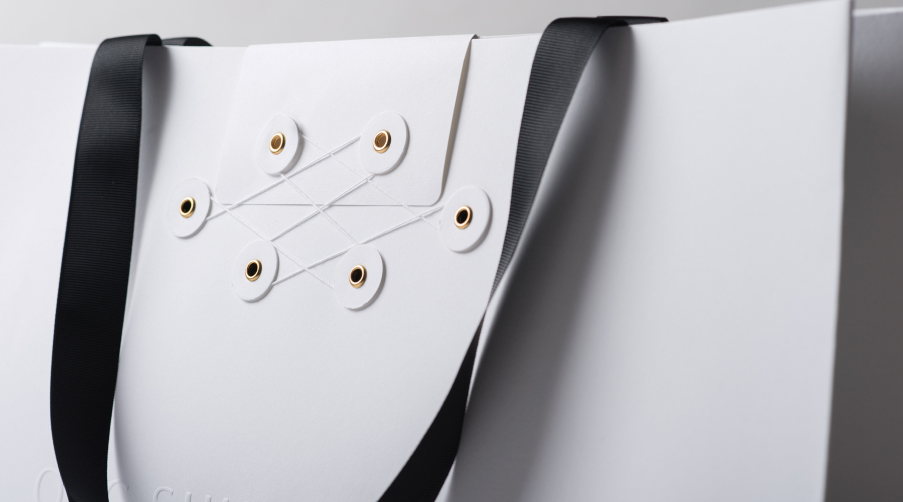
We also translated the sharpened brand narrative into the shopper experience, elevating transaction to a form of ritual. The Prosperity Knot – a traditional Chinese symbol of eternity and abundance – inspired the design of Ong Shunmugam packaging. Each purchase turns into ritualised moment, marking the transfer of ownership between brand and buyer and sealing the bond between each garment and its wearer.
Expanding the OS Universe
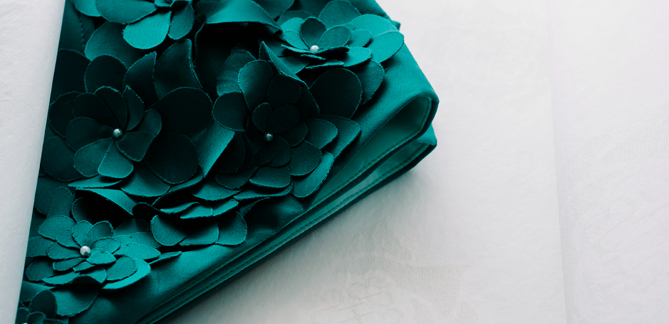
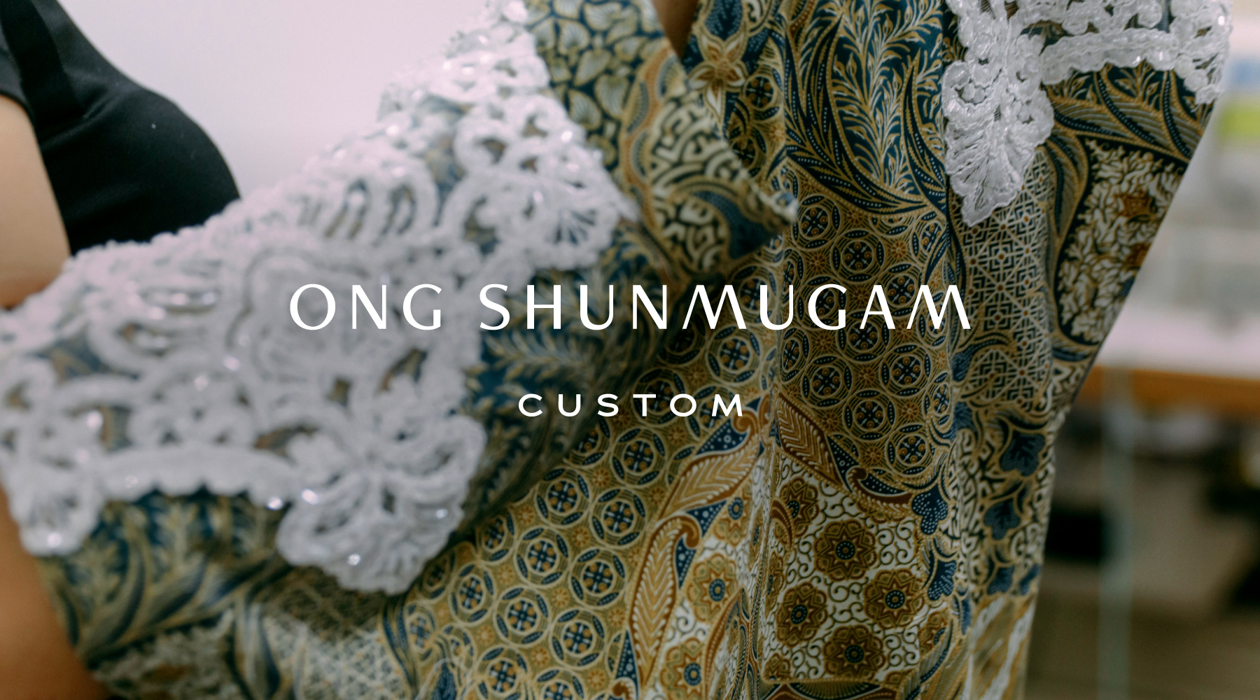
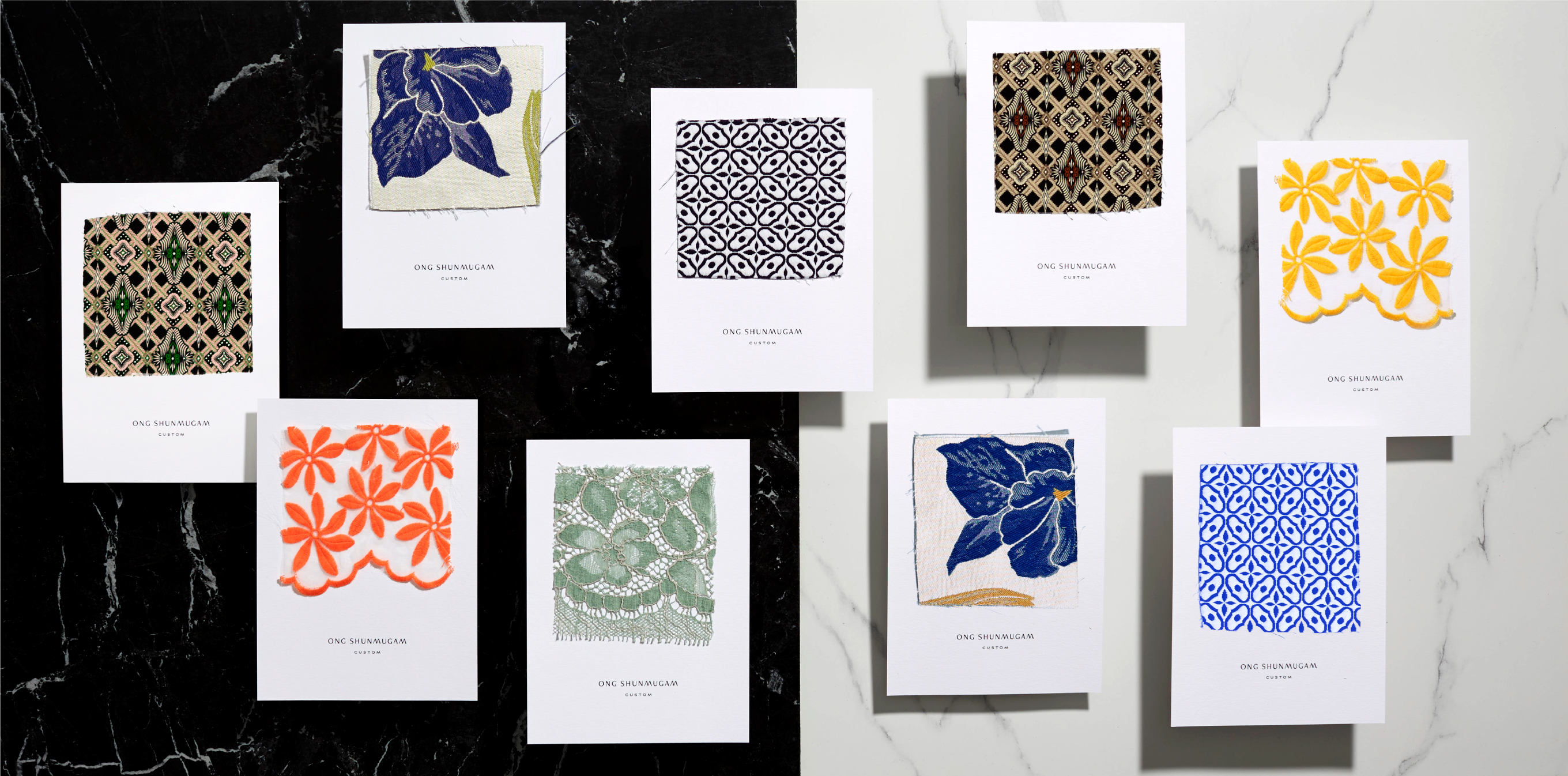
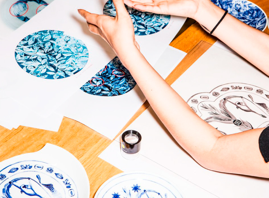
Our new, carefully defined brand narrative for Ong Shunmugam helped drive their expansion across different verticals – from custom tailoring to tableware, home furnishings, and a ready-to-wear line.
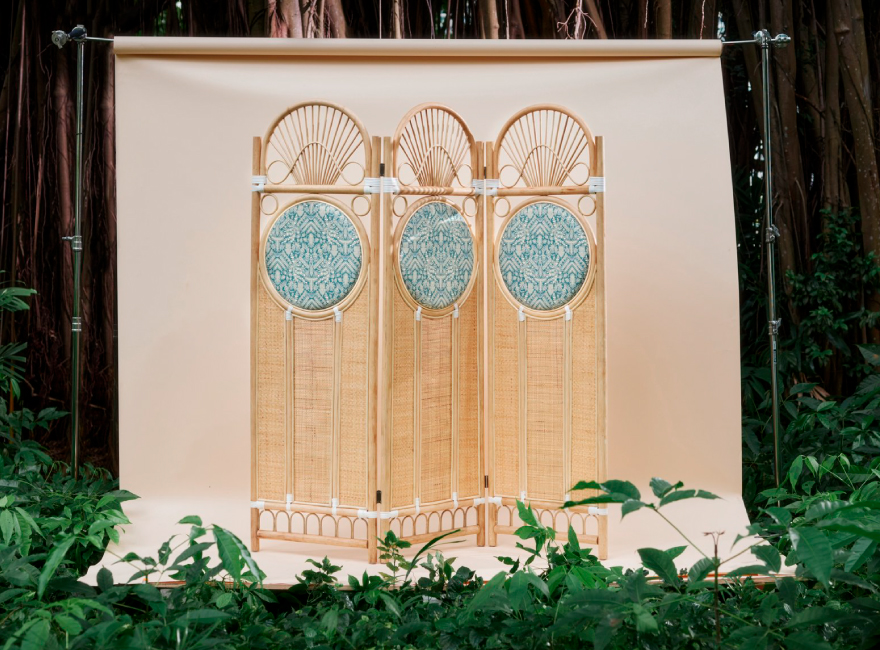
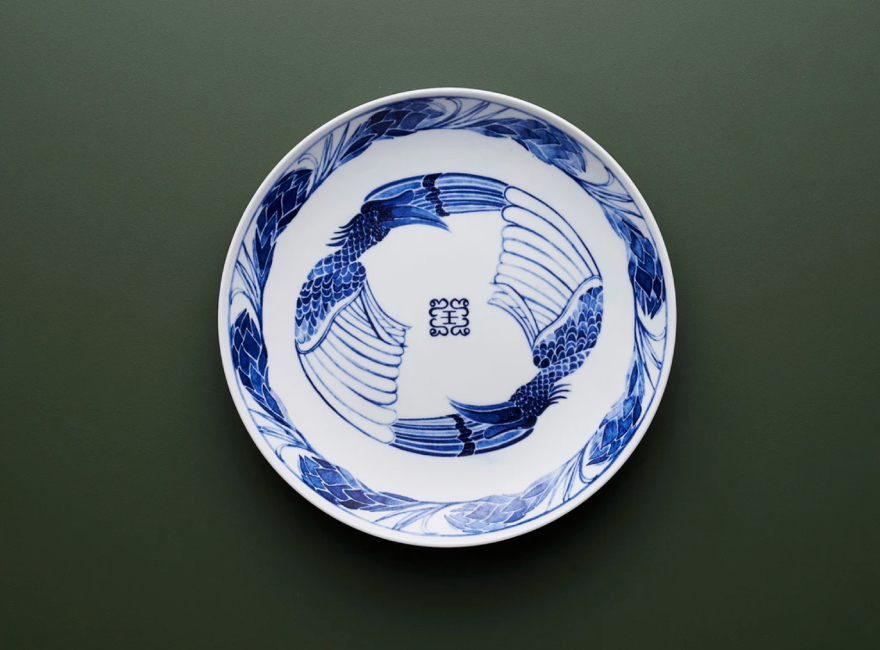
Photography (Tableware, Home furnishing): © Ong Shunmugam

