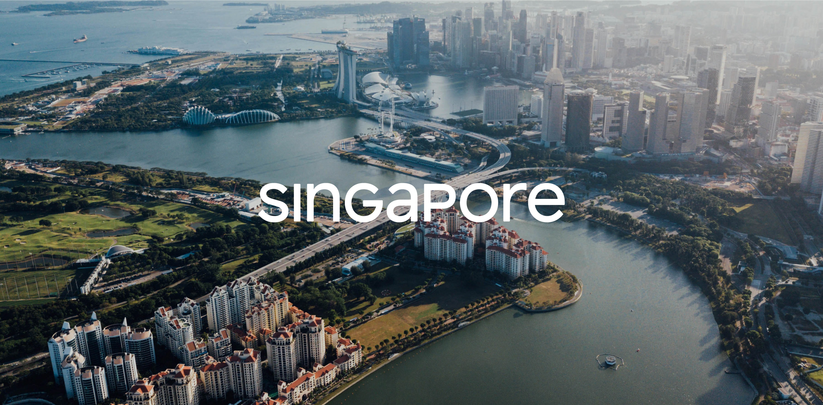
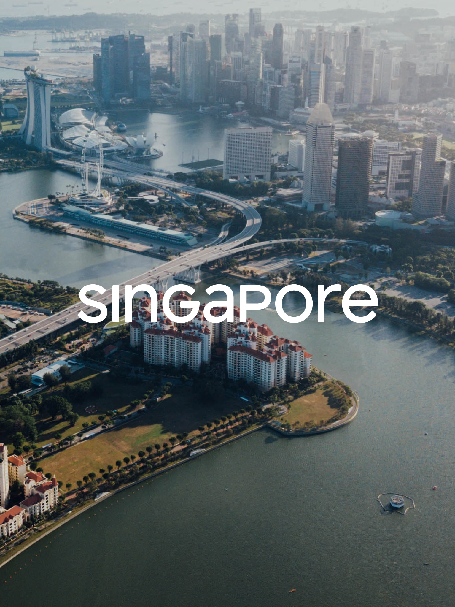
Singapore’s first nation brand
BRAND SG
It was the 52nd year of Singapore’s independence and the country had an identity crisis. Singapore had spent half a century creating progress & excellence for its people, but had never stopped to investigate and express who she really was. This was the first time in the nation’s history that brought together all the disparate brand stories across the various government agencies, and re-imagined it as a truly unified nation brand that did justice to the country.
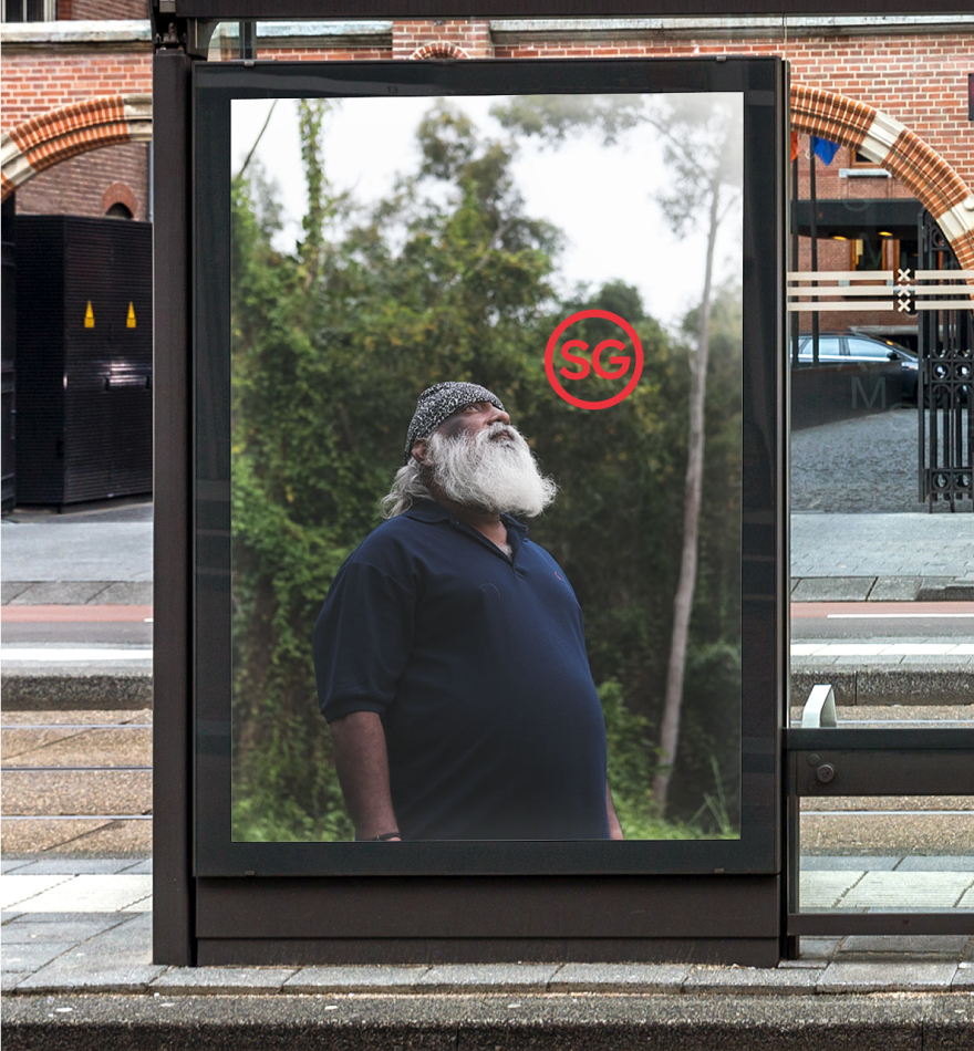
The SG Mark
The genesis of the mark was the well-loved SG50 logo by Singaporean designer Jackson Tan in celebration of our country’s first half-century. An affectionate play on the “little red dot”, we created a custom unicase typeface that was based on geometric forms, highlighting the circularity of the red dot.


A Mark of Pride
The SG Mark is more than just a logo, it’s imbued with the behaviour of a trademark symbol – a familiar mark of origin and distinction. Applied to the top right corner of copy and imagery, we’re able to showcase a plethora of products, people, services or ideas – anything the country is proud of. It captures all that is iconic about SG, but also what is new and surprising about this country. Creating a brand system that is able to evolve alongside Singapore’s rapid progress and huge ambitions.


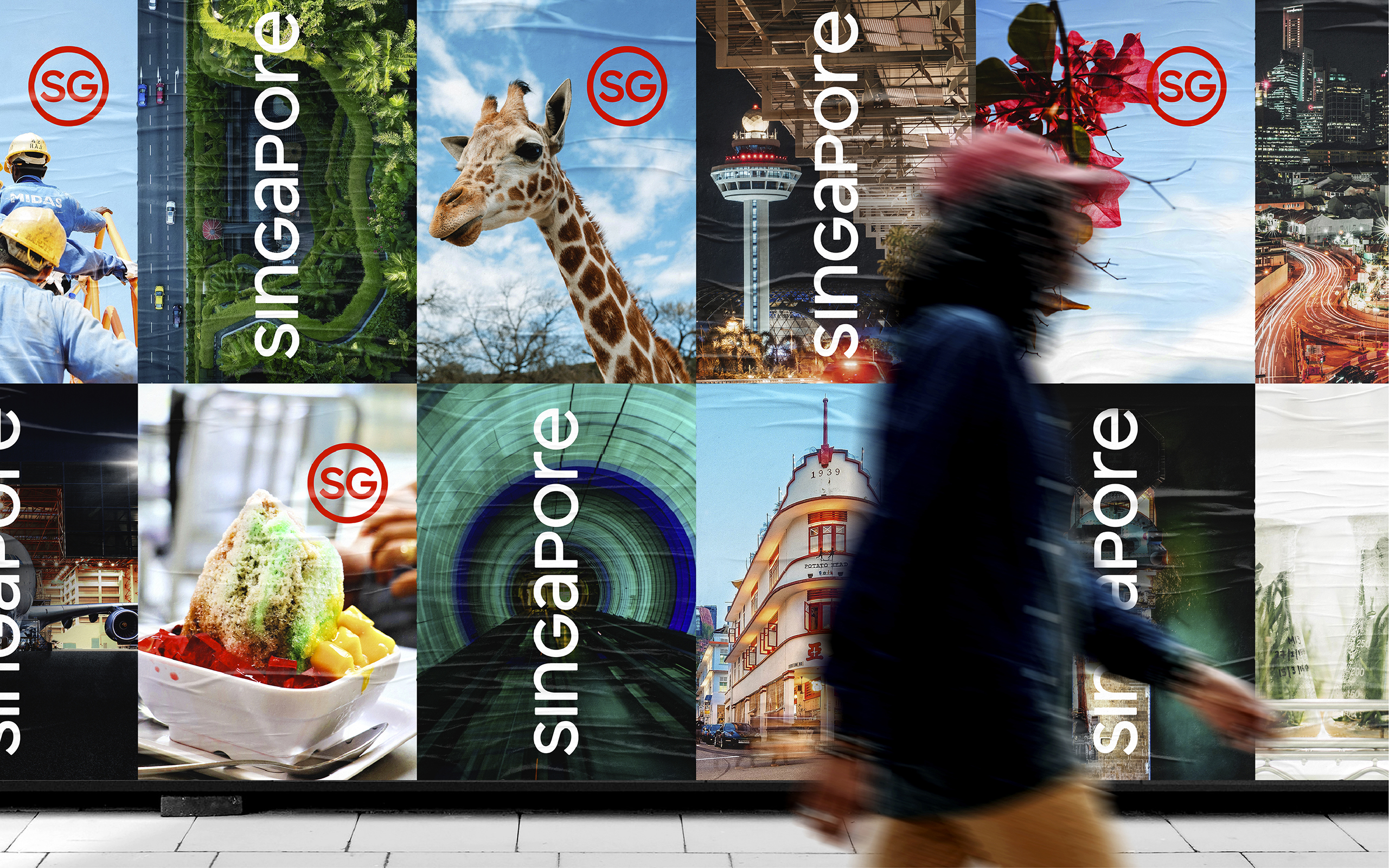

Launching the Singapore Brand
We united all the governmental agencies under a single brand truth, purpose and belief. Through multiple workshops and advocacy sessions, we helped our leaders bring the brand to life. Articulating each agency’s vision for Singapore’s future and the role of the SG brand. The brand has since been adopted across diverse facets of nation building – from policy-making to grassroots initiatives, from tourism to investment campaigns. The SG Mark is well on its way to becoming a true icon of Singapore.